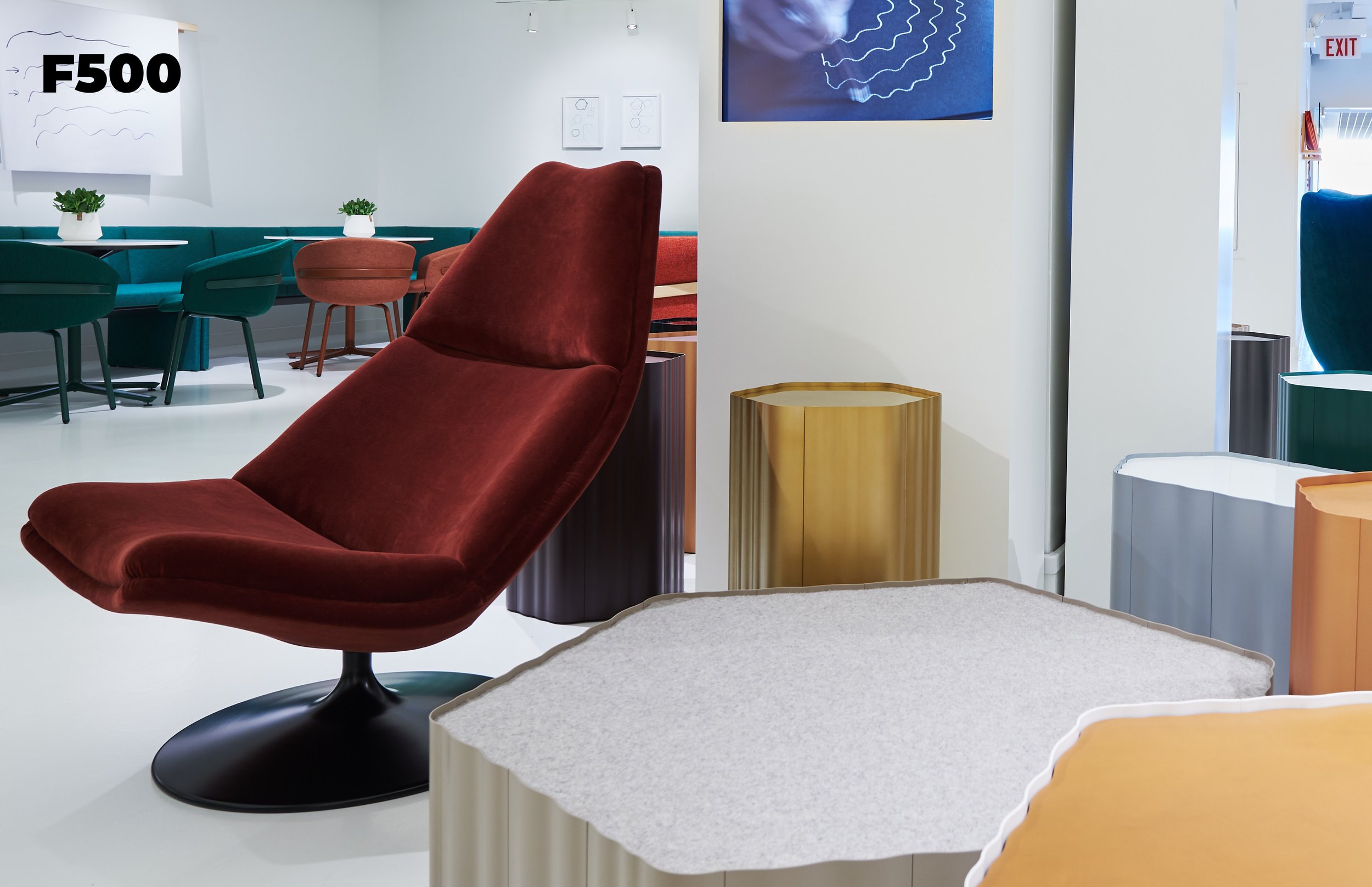
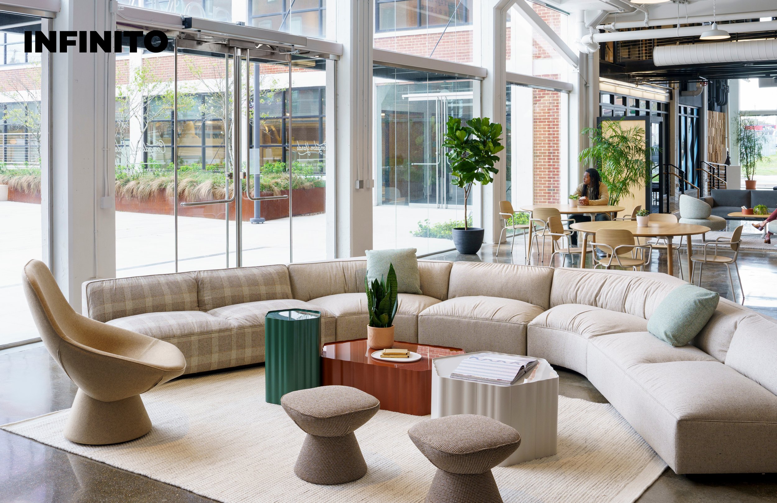
Studio Tk Top 6 Colours
Leveraging my color expertise, I contributed to an exceptional project. My mission: curate the top 6 colors in interior design for 2024 and select THE color of the year for Studio Tk. This endeavor immersed me in the captivating realm of emerging trends. Driven by the desire to define the most significant trends for the upcoming year, I invite you to explore each of the six colors, which all have the potential to dominate our interiors not only in the next year but for many seasons to come.

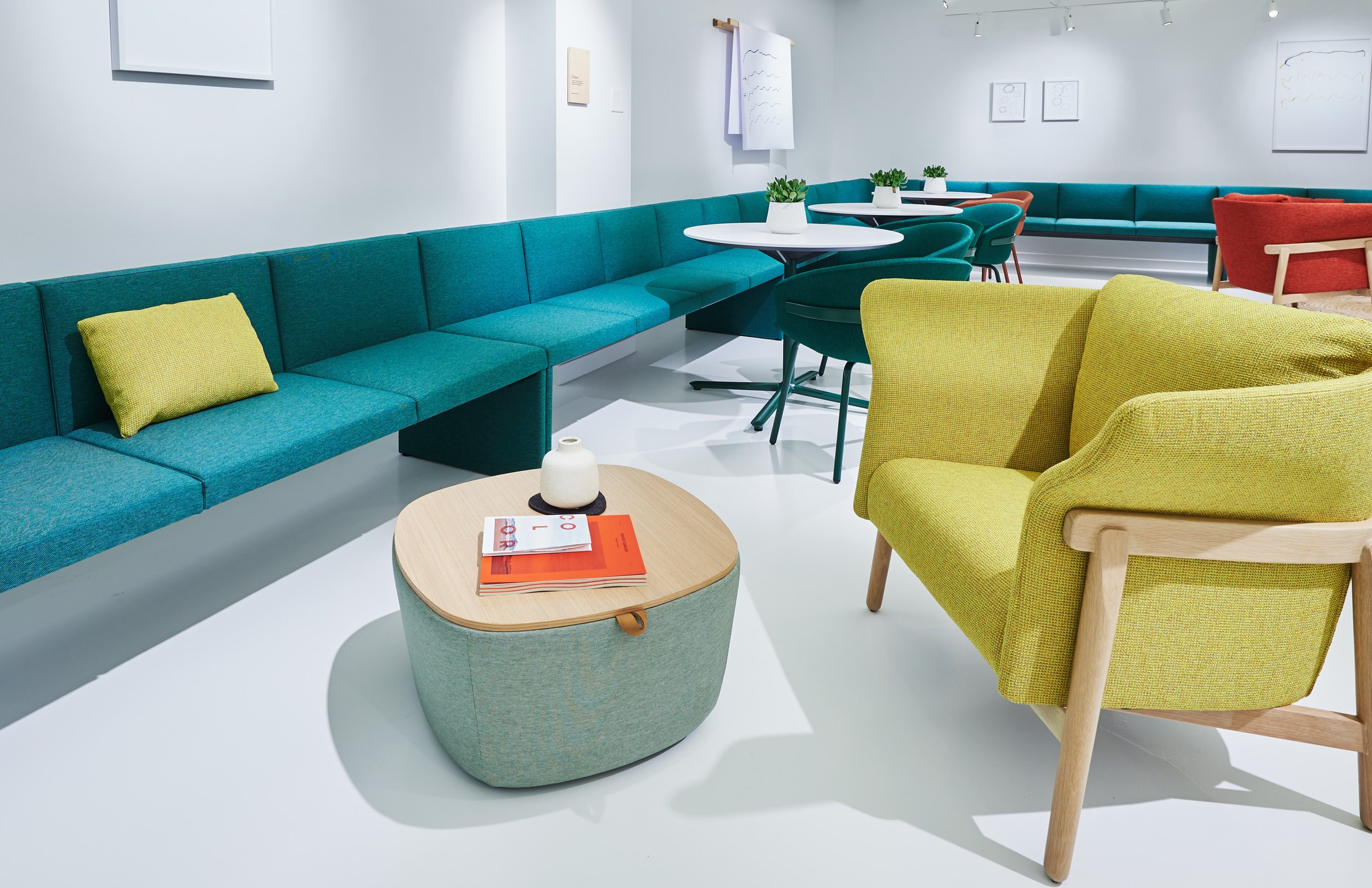
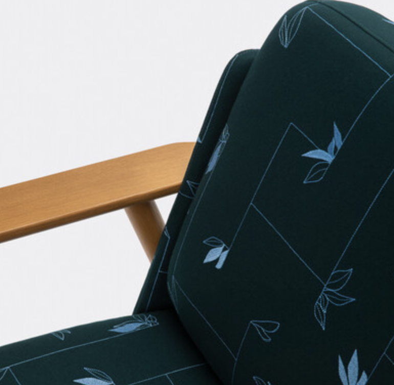
boréal
For decades, gray has reigned supreme in our interiors, symbolizing neutrality and sobriety in an often turbulent world. This hue has become the perfect refuge for us to escape from technological overstimulation and the incessant flow of often troubling news that characterizes our daily lives. Yet, despite its ability to provide some relief, gray fails to offer a true respite.
That's why I'm convinced that green will emerge as "the new gray." As nature's ultimate neutral, green has the power to rejuvenate our minds and reconnect us with our environment. Allowing us to absorb more oxygen in its presence, this color offers us a breath of fresh air, offsetting technological overstimulation and restoring a vital balance by reconnecting us with the fundamental elements of life.

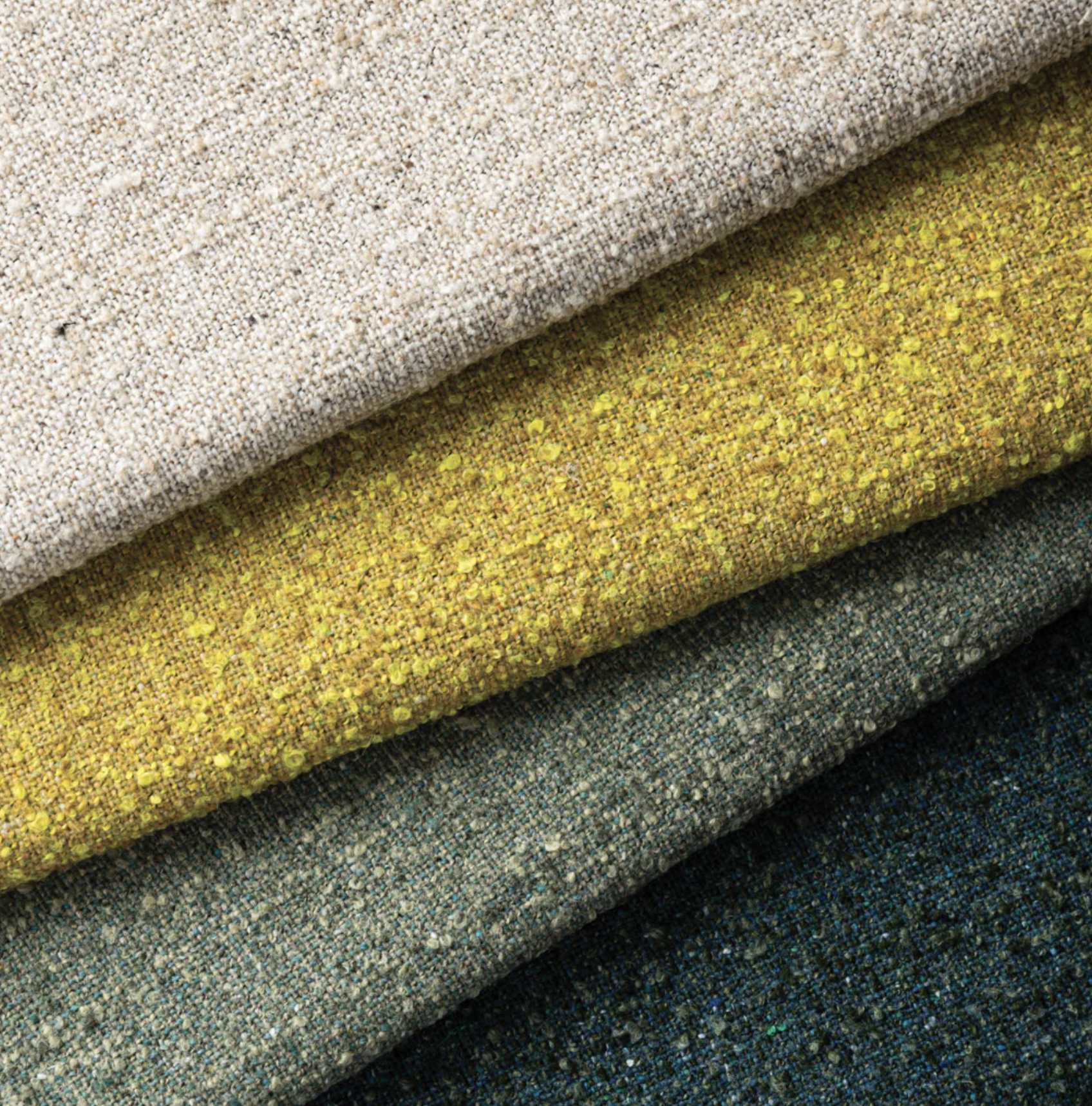
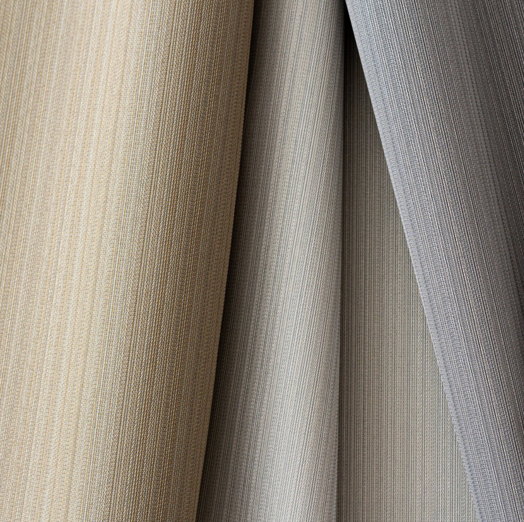
Latte
Latte transcends its status as the most served milk-based beverage in cafes worldwide! Once regarded as a dull or bland shade, beige now undergoes one of the most remarkable rebrandings of our time.
This warm neutral, reminiscent of warm sand, proves to be as versatile as its predecessor, gray. Seldom the star of any trend report in recent years, beige now emerges as an elegant and even alluring option, aligning with the movement towards self-care and self-acceptance. Moreover, it embodies the principles of sustainable design.
While certain dye pigments leave a considerable environmental footprint, natural, uncolored beige positions itself as organic, versatile, and environmentally friendly.

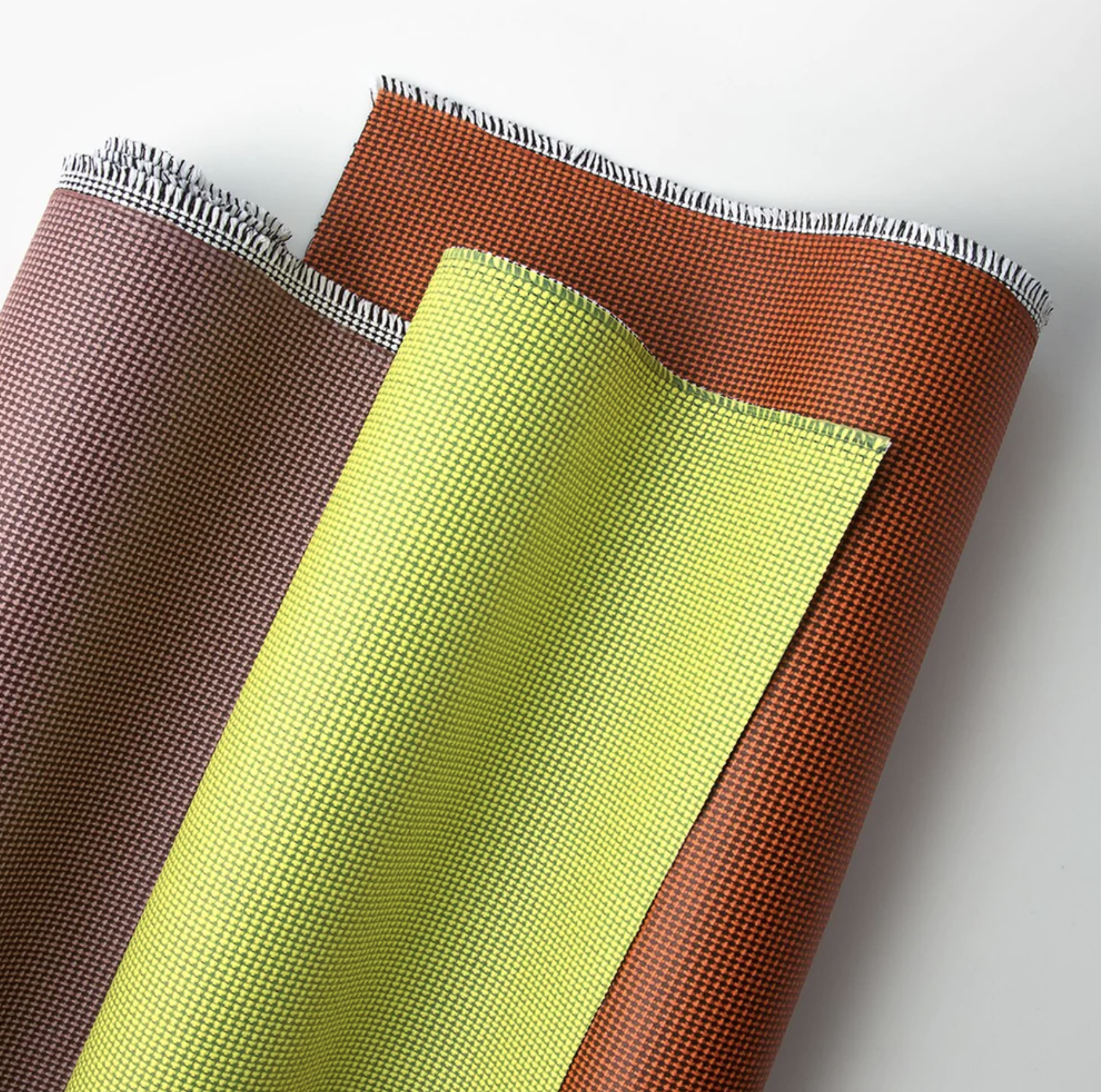
Lichen
Lichen, a bold yellow-green, establishes a harmonious link between nature and technology. In a global context marked by tensions, there is a yearning for vibrant and optimistic colors like yellow, but current reality hardly lends itself to celebration. Lichen provides a captivating alternative, blending natural character with electrifying energy. This dynamic hue meets our urgent need for revitalization and renewal, allowing us to draw from a source of inspiration and vitality.

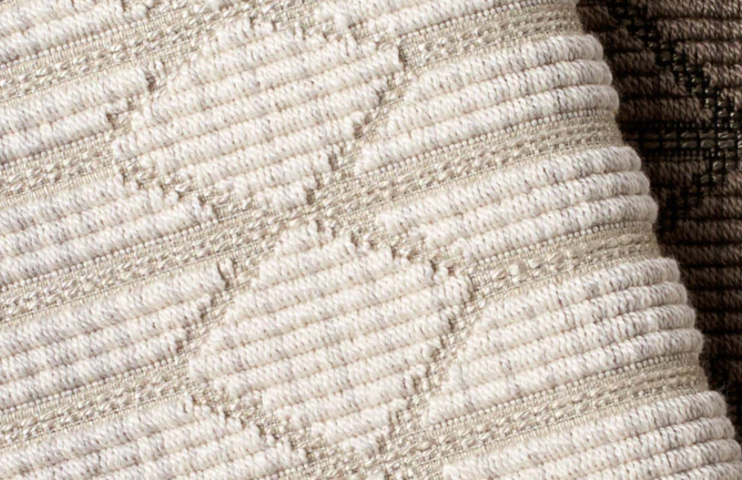
Sherpa
Sherpa, a soft off-white infused with a subtle hint of optimism through its yellow undertone, symbolizes a return to minimalism and a desire for a simpler, less complex life. This hue evokes gentleness and provides a space for contemplation and rejuvenation. In these tumultuous times, where the world often feels turbulent and noisy, Sherpa embodies a peaceful refuge, inviting tranquility and reflection. Its gentle and soothing tone creates an atmosphere conducive to relaxation and serenity, offering a welcome balance in our hectic lives.

DIAPHANE
Diaphane, a hue evoking lightness and transparency, harkens back to the inception of Pantone's Color of the Year initiative launched in the year 2000. Pantone had chosen to anoint Cerulean Blue as the inaugural Color of the Year, offering a glimmer of hope amidst uncertainties surrounding the dawn of a new millennium. This symbolic choice of sky blue represented constancy in a world where certainties are rare, underscoring that despite turmoil, the sky always reverts to its azure hue, bearing a message of resilience and renewal.
In recent years, marked by a series of tumultuous events such as the pandemic, polarization of opinions, global conflicts, and concerns over the rise of AI, this message carries particular significance. Diaphane also evokes a growing desire for transparency, whether from our leaders or information sources, emphasizing the need for clarity and honesty in an ever-changing world. As we are accustomed to the blue sky being the backdrop of our external universe, our longing for stability and certainty is reflected in our choice of interior colors.
Diaphane encapsulates this essence by bringing a familiar tranquility to our indoor spaces. Its subtle and refreshing tone recalls vast expanses of clear sky, imparting a touch of serenity and calm to our interiors. By choosing Diaphane, we aspire to create a refuge, a place where we can rediscover the same constancy and peace found in the vast firmament above our heads.

cognac
At the helm of my top 6 colors for interior design in 2024, I've crowned the sumptuous hue of Cognac as Studio TK's Color of the Year. Far more than a passing trend, this reddish-orange-infused brown embodies stability and grounding in ever-tumultuous times. Paired with a hospitable energy and comforting warmth, it provides a welcome sanctuary in a perpetually bustling world. By choosing Cognac, we opt for a grounding color that allows us to anchor ourselves while adding a touch of sophistication and authenticity to our living spaces.

in conclusion
In conclusion, while the composition of the top 6 trending colors for interior design in 2024 emerged swiftly, selecting a flagship color for the year proved to be relatively challenging. Each of the six hues showcased remarkable potential and embodied fundamental needs, addressing different imbalances in our contemporary society. This diversity of choices reflects the richness and complexity of our current design and lifestyle concerns.
However, the color Cognac effortlessly rose to the top, offering a diverse array of remedies for our ailments within its composition: from the stability of brown, through the excitement and warmth of red, to the grounding of brick and the hospitality of orange, Cognac provides a rich and varied palette of emotions and sensations, making it an ideal choice to breathe life into our interior spaces and offer us a comforting refuge in an ever-evolving world.
Ultimately, whether it's Cognac or one of the other colors in the top 6, it's important to remember that each hue can contribute to well-being in our interior spaces. By prioritizing well-being, we create environments that foster mental health and physical comfort, which always remains the most essential consideration in any design process.